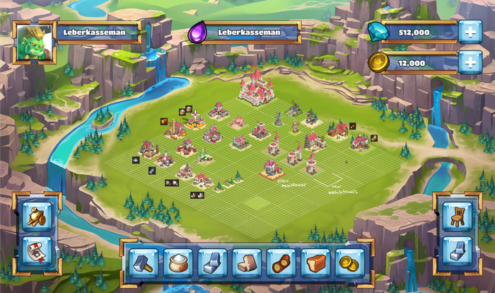
In Age of Knights I held a Lead UI position. I kick started the UI of the game. I iterated the style until founding the one that was working better for us. I started designing the HUD, containers and buttons. After that was defined I moved on into designing the main in-game screens. The next step was implementation in unity.
The idea was to meet with the whole team on several occasions and let them choose what they wanted. The team had our project lead, our art director, and all the developers. I prepared initially 7 HUD-finalized mockups and presented them all to them. Only three of those got more iterations and in the end, one got picked.
The materials are glass and metal for the HUD UI components. For the buttons, I created them as valuable crystals or gem-like stones.
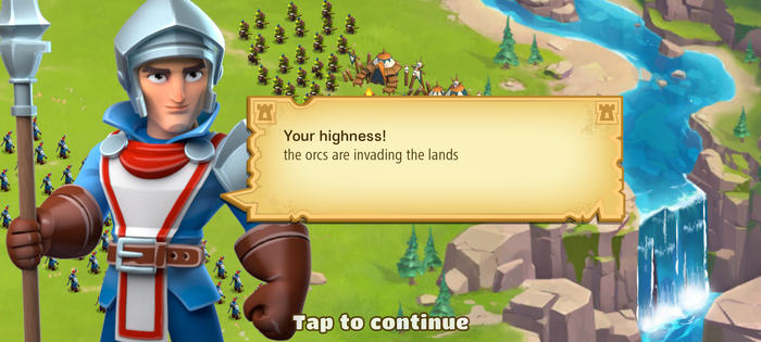
I designed clean parchments with corner details. A big massive character like he is coming to tell you something you should pay attention to. The orcs are going to raid you!
I created tabs that have high contrast. I created then all the overstates for the buttons needed and for the value displays to stay blue which was present in characters mostly.
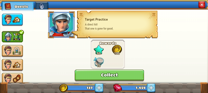
For the popups, I created a stone barrier-looking footer. The header stays metal and the banner like blue. The close button I wanted to be urgent but also likable. And for the background that resembles a wall with some cracks but is not too dirty
All concepts and Artwork presented on this website are protected. Do not use without authorization Copyright © All Rights Reserved


