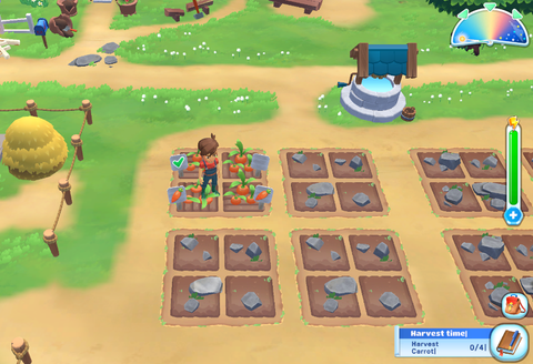
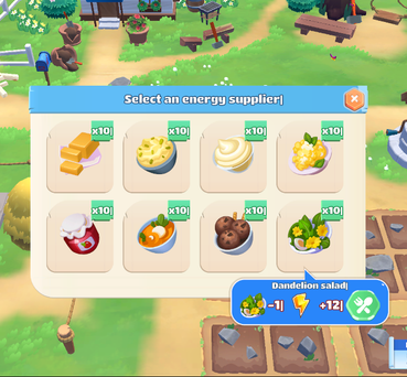
In Big Farm Story I held a Lead UI position. I proposed a UI which was stylized for a mobile RPG game. After finding the style I designed and implemented the UI. I also created most of the UI assets and structured the libraries. In the most intensive player featusres I designed a more diegetic approach. I kick-Started the visual look of the icons, finding the most fiting style taking into account color, shading, outlines and shape. This project was launched later on Steam.
In the screen, I wanted to have a lot of space for the animated background. The semi transparent backgrounds and panels to be more integrated with the background in general

I designed in a clear way so that the playwers experience a relaxed start of the game.

The information alters the color of the background to improve readability

The pop-up blends in with the background, the information is readable and the decision is enhanced with green

The input box very bright to enhance the black text

The information alters the color of the background to improve readability

The input box very bright to enhance the black text
Here you could advence trought the story be getting tips and information form NPC's. It was aslo the place to find new paths in the story and receive rewards from NPC's.


This is the place to buy items with several uses, for example: To buy item Items needed in the main quest, and side quests and also sell the items you produce in your farm.

I designed the shops with personalized colors depending on the NPC. The buy and sell buttons are integrated into the shop as sing displays. The buy and Sell had color differentiation and the color opacity change for the over states of the buttons.
I designed and created the UI elements present in the game like HUD elements (weather widget, experience icon progress bar, energy bar, quest button) , in-game conversations, character UI for using or collecting, signs, and pointing arrows.


The level-up is triggered and shows your character on the left side. The right side is reserved for all the action and information connected to achieving a new level.
To be bale to enhance the animation with rotation the cards are rendered in 3D.

I designed the quest journal with some decorative drawings, toggle arrows, tabs, and drawn containers selected and unselected.


in the shop the player could buy a lot of the items of the game. In the hierarchi we had three main categories and each categorie had also two or more subtabs.
I wanted the shop to feel open and not completely woody and dark. I also added a blurry background to bring the items to the front.


I wanted to have a floating offer that had a 3D feeling to it. I made a dark layer in the back so all the shiny elements could be better visualized.
We had different types of this interactions were the player needs to use items for particular funtions in the game.

The overlapping container allows the player to continue the transaction. And to enhance its hierarchy position I made it in blue. The background container already had items to display so it becomes better readable.

This was another position of the overlapping container where it was displayed below, to not cover the items and reduce confusion for the player.
I desined the tabs on the top of the container. The tabs get affected by the sun and the idle state has shadows. I know that most of this screens are boring so I decided to have a chilled background .

I designed this screen with an animated character on the left side. Sometimes an alpaca would take her place, don't ask me the alpaca was very good in math.

I designed the Build screen with a rotational 3D model in the middle. The starburst was also rotating to enhance value. The whole screen changes the color of the background when the player has the requirements to unlock the building.


For the icons style, I started an exploration of shape. Then for the color and shading, I saw inspiration from other games like Legend of Zelda: Spirit of the Wild. It was necessary to try some colors first and define the level of detail we wanted for our icons. After the style guide was done it was time to ship them for mass production. I used Illustrator for the most part since polishing was not needed up to this stage.


I assigned different categories for the icons, defined by the places where they would be used. Some more simple indicators. A bit more detailed and with color for quick actions, completely rendered to be present in the HUD or collected in some other places.
All concepts and Artwork presented on this website are protected. Do not use without authorization Copyright © All Rights Reserved